Good afternoon Race Fans!!
It’s quite a race we have going upriver from Bethel. Teams are stretched out for many miles, but layover times and other factors are still at play.
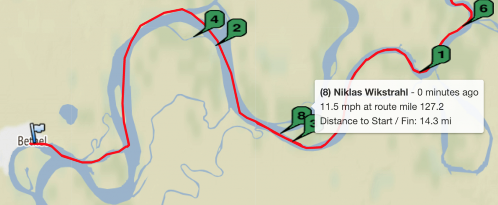
Speaking of playing, one of the tools we have in our speculation toolbox is what TrackLeaders calls Raceflow. This is a really great tool to see who is gaining and who is losing over the course of a race. Most people don’t look at it, but I’d encourage you to take a look.
It’s a bit confusing, but here’s how it goes. The Teams are sorted as to their position. Each Team has a line that corresponds to their location on the course, but also their speed. As you look at lines close together, that means that Teams are close on the racecourse. As lines converge, for example a lower line starts to run over another line on top of it, that means one Team is overtaking another.
If you zoom in to the lines you can start to see as Teams start to falter or which ones, maybe after a break, get faster.
In the case of this Race, you can just see a bit of difference between the Team lines. They aren’t parallel to each other.
So for good old fun, I make parallel lines on each Team and then sorted them to see which Teams are faster than the other.
What I am finding is that Matt Failor’s Team is really the jackrabbit on the course. His speeds are steady and fastest over the course. Second, and only by just a little is Pete and the Team.
Take a look and see for yourself. It is great fun to analyze. The second year Pete won the K300, the second place Team, Brent Sass was converging quickly. If the race would have been a few miles more, he would have caught Pete and lost by only 8 minutes!!
See that year (2016) by clicking the thumbnail
.
Take a look at this year’s raceflow and the parallel lines I just created. It’s still anyone’s race!